
Telecomm Customer Churn Dashboard - Tableau
Telecom Customer Churn Dashboard
Behaviour Analysis
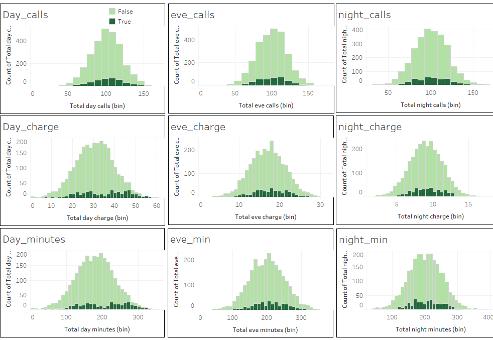 The dark green bins show the behavior of the customers that churned, and we can clearly see a similar pattern across different times of the day for the customers that left the telecom company. They have a smaller number of calls, hence less minutes, and less accumulated charges.
Location Wise Analysis
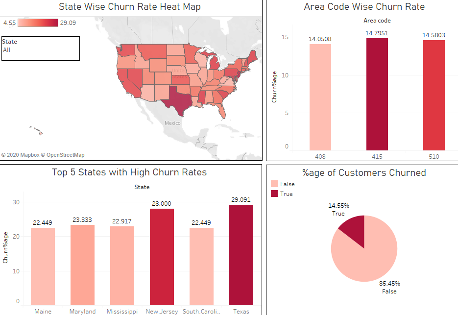
- Texas has the highest Churn Rate of 29.1%
- Almost 15% percent of the customers churned for this specific telecom company
- Area with the code 415 is considered to be the area with the highest churn rate of 14.8%
Subscription Analysis
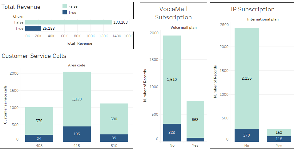 This Dashboard reveals that customers who churned weren’t quite profitable. They didn’t subscribe to the plans offered by the company. They didn’t turn out to be much profitable for the company.
This reveals that the plans offered by the company weren’t appealing to these customers. They didn’t interact with the customer service center representative much, indicating that they weren’t quite connected, and loyal to the company.
This Dashboard reveals that customers who churned weren’t quite profitable. They didn’t subscribe to the plans offered by the company. They didn’t turn out to be much profitable for the company.
This reveals that the plans offered by the company weren’t appealing to these customers. They didn’t interact with the customer service center representative much, indicating that they weren’t quite connected, and loyal to the company.